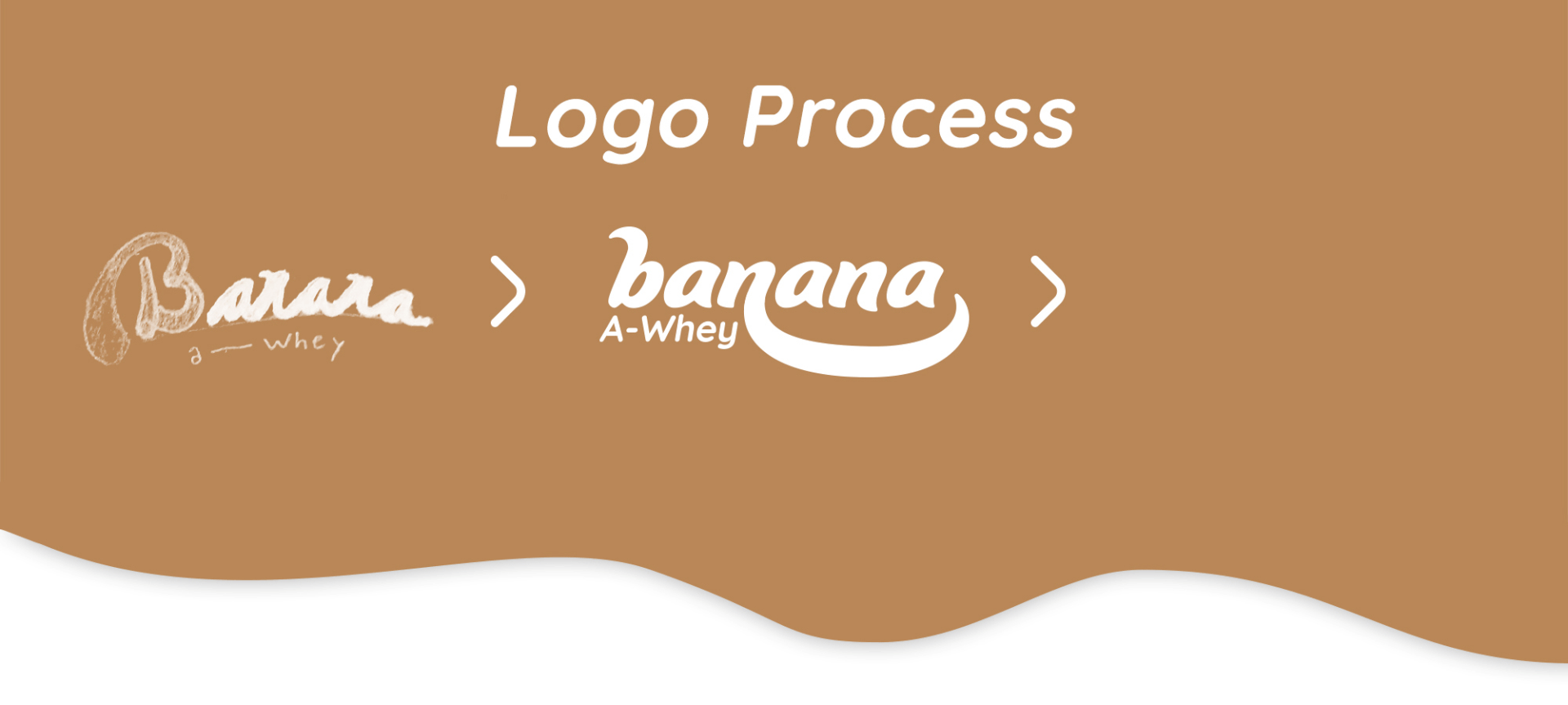
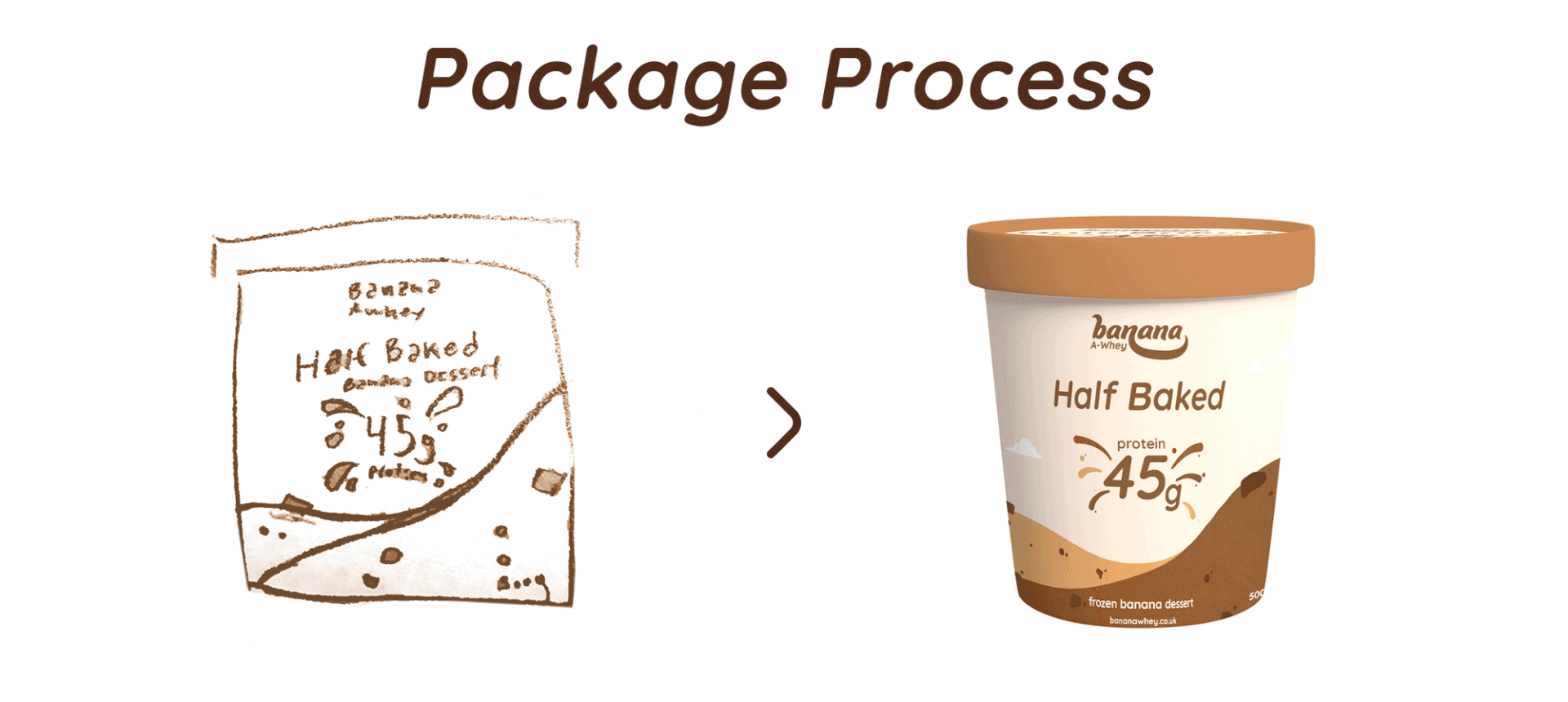
Banana A-Whey is a new product to the frozen aisle and needed a package that stood out, but also had a similar feel to the brands customers have come to love. Along with creating a logo that is fun and inviting the brand has had a pretty big hit in local grocery stores in the UK and continues to grow.
Their mission is to change how people view the word 'healthy' and that having a healthy lifestyle can be easier these days with brands such as Banana A-Whey. Their hope is that people would start making better food choices and also enjoy what they eat while making the change.
chocolate chip ice-cream under a logo called 'banana a-whey'
Process of logo design. On the left is a rough drawing of the logo. Middle is a static image of the final logo, and on the right is an animated version of the logo.
Package process. On the left there is a rough drawing of the package design and on the right is the final design of the ice-cream pint rotating.
45g protein in bold in the center of the image with different ice-cream flavours exploding out from the center. Pint flavours are brownie, candy cane, half baked.
Laptop showing website mockup. Website is scrolling down to showcase benefits, flavours, and what's inside each pint.

You may also like

Back to Top